
Rapid Response Design: Helping the restaurant Industry Navigate COVID-19 food Safety
Before founding Americana Creative House, our founder and creative lead, Kat Ignacek, worked with the team at ServSafe (National Restaurant Association) to help rapidly develop visual assets for a nationwide safety training initiative at the onset of the COVID-19 pandemic.
This project continues to reflect the thoughtful, impact-driven design approach we carry into every client collaboration today.
When COVID-19 disrupted daily life, restaurant workers found themselves on the front lines of a rapidly changing industry. To support them, ServSafe released a series of free online training courses offering clear, accessible guidance for takeout, delivery, and reopening procedures. These were designed to protect both workers and customers—at a time when confusion and fear were high.
“This was a deeply meaningful project—one that used design not just as decoration, but as a tool for support, confidence, and rapid education.” -Kat ignacek
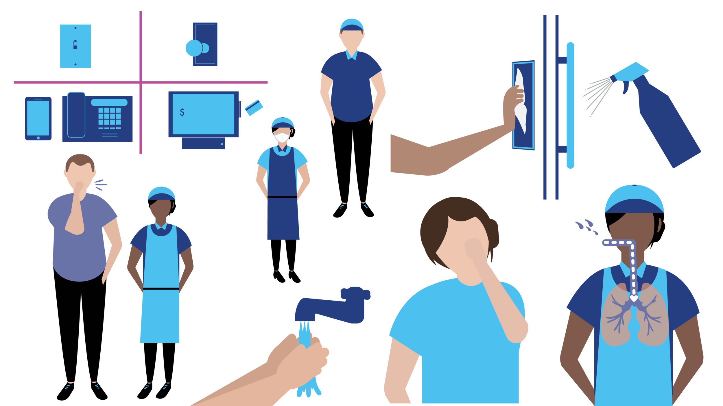
Kat was brought into the project to concept the illustration style and create visuals under a very tight and strict deadline. The visual language had to do more than just look polished—it needed to reassure, educate, and empower. That meant designing an illustration style to reduce anxiety, promote clarity, and support memory retention in high-stress environments.
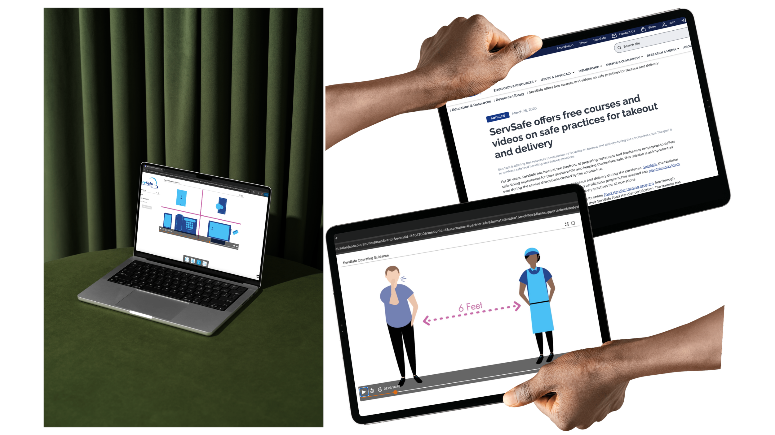
She leaned on clean, minimalistic shapes to build each element and friendly, grounded, brand adjacent colors to reduce cognitive load and make information easier to digest. The courses—"ServSafe Takeout: COVID-19 Precautions," "ServSafe Delivery," and "ServSafe Reopening Guidance"—covered topics like preparation, de-escalation, and situational awareness. Each illustration served as a visual anchor, reinforcing key messages and creating consistency across modules.
read more about the process below!
read more about the process below!
Design can be a lifeline in times of crisis. In a world of uncertainty, clear, simple visuals can empower people to act with confidence and clarity—something TO BE proud to have brought to life for the food service industry during the pandemic.
The design Breakdown
01. Empathize: Understand the Urgency & Audience
Restaurant workers were navigating fear, uncertainty, and rapidly changing expectations. Understanding their emotional and mental state was key to designing visuals that felt supportive rather than overwhelming.
02. Define: Communicate Safety Without Overwhelm
The core problem was clear: how do you distill vital safety information into visual form without adding to the noise? The goal became simplifying complexity into confidence-boosting clarity.
03. Ideate: Concept a Style Under Pressure
With speed a top priority, Kat developed a simple, flexible illustration style using universal shapes and clear compositions that could adapt to different modules quickly and effectively.
04. Prototype: Build Visuals That Feel Human
Sketches emphasized calm tones, soft forms, and inclusivity. Each visual was paired with a specific behavioral cue, ensuring the imagery did more than decorate—it instructed and reassured.
05. Deliver: Fast Turnaround With Purpose
The final illustrations were created, approved, and deployed in record time. The end result: a series of training tools that helped workers feel safer, more informed, and better equipped—right when it mattered most.